iterating like
a scientist,
shipping like a degen.
> this is the brand identity for mattdgn / gmgm.fr — a working
solana dev based in paris.
> this doc is the source of truth for colors, type, logo, voice.
> if it conflicts, this doc wins.
the wordmark does the work.
no bespoke icon. the mark is the name set in space grotesk 800, with the suffix in red. a circular monogram exists for avatars and small marks.
monogram · M
for avatars, favicons, og-images, social profile pictures.
five colors. that's it.
lila is the surface. ink is the structure. red is the punctuation. yellow and orange are accents.
distribution rule · 60 / 30 / 10
the eye should land on lila first, ink second, red third.
page backgrounds, big empty space.
text, borders, headlines. the skeleton.
links, the suffix in the wordmark, the sticker.
three faces. three jobs.
space grotesk does the talking. jetbrains mono does the working. caveat does the swearing.
tracking -0.04em on display
leading 0.92 on H1, 1.4 on body
tracking 0 default, 0.15em uppercase
leading 1.6 on body, 1.7 on lede
color always red
rotation -2° to -3°, never +
type scale
the "hello, i'm" sticker.
the sticker is the only piece of personality the brand allows itself. use it on hero sections, contact cards, business cards, and merch. never on UI elements like buttons.
animated · "hello, degen"
for the home hero only. the name is drawn live, stroke by stroke, the way the apple "hello" film does it. loops every ~6s. rotates through matt → degen → dev → ship.
sizes
- · background always red (or yellow / orange / ink)
- · no outer border · radius 16px outer, 8px inner
- · rotation between -8° and +8°, never aligned
- · name handwritten, always rotate -3°
- · max 1 sticker per viewport
- · never animate the rotation on hover
- · never replace "HELLO, I'M" with other text
- · not on UI elements (buttons, badges, nav)
three avatars. three moods.
the brand uses three rotating profile pictures depending on context. each one signals a tone — builder, degen, gm.

the default. SMB collection. use on solana-related contexts: dev posts, builder threads, conf badges.
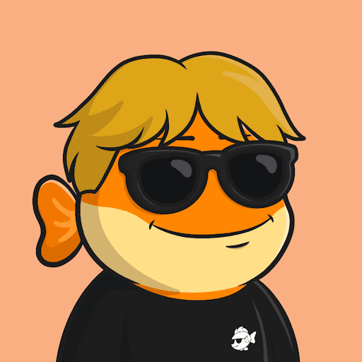
use on nomu_stores work — product launches, customer support, anything tied to the brand.

off-duty. use on shitposts, degen threads, weekend hacks, things you wouldn't put on a CV.
- · always square crop, never rounded inside the file
- · round mask is applied by the surface, not the PNG
- · never AI-upscale or stylize
- · monogram (M) is the only fallback
- · don't mix two PFPs in the same surface
- · don't pair PFP + sticker on the same axis
- · don't recolor the PFP backgrounds
building blocks. small kit.
the brand is intentionally light on components. buttons, stamps, tag-pills, highlight, terminal. if you need a new pattern, write it once here before using it on a surface.
hover: ink → red, ghost → ink-fill, +translateY(-2px).
always rotated. always border + colored text (no fill).
always lowercase. always ink border (no color fills).
one per heading max. never combine with the handwritten accent.
three cards, one system.
three OG templates depending on what you're sharing. all 1200×630, ink border, same wordmark anchor top-left.
shipping like a degen.
ask for your email.

- · always 1200×630 (works everywhere)
- · wordmark always present, never alone
- · max 1 handwritten word per card
- · headline ≤ 2 lines, weight 800
- · no logos of clients, no badges
- · no gradients, no drop shadows
- · export PNG, ≤ 250kb
- · file name: og-{template}-{slug}.png
the daily handshake.
drop this at the bottom of every email from matt@gmgm.fr. don't add quotes, motivational lines, or socials beyond the three core.

banners + signature. copy / paste / ship.
on-brand assets ready to drop into linkedin, x, and email. images generated dynamically — open the link or right-click to save.
email signature
copy-paste ready. works in gmail, apple mail, outlook. uses absolute urls so the pfp loads anywhere.

<table cellpadding="0" cellspacing="0" border="0" style="font-family: -apple-system, 'Segoe UI', Arial, sans-serif;">
<tr>
<td style="padding-right: 18px; vertical-align: top;">
<img src="https://gmgm.fr/brand/pfp-nomu.png" width="64" height="64" alt="matt" style="border-radius: 50%; border: 2px solid #0a0a0a; display: block;" />
</td>
<td style="vertical-align: top; border-left: 2px solid #0a0a0a; padding-left: 18px;">
<div style="font-family: 'Space Grotesk', -apple-system, sans-serif; font-weight: 800; font-size: 18px; color: #0a0a0a; letter-spacing: -0.02em; line-height: 1.1;">matt<span style="color:#e63329;">dgn</span></div>
<div style="font-family: 'JetBrains Mono', ui-monospace, monospace; font-size: 12px; color: #3a3530; margin-top: 4px; line-height: 1.5;">solana dev · founding @ <span style="color:#e63329;font-weight:700;">@nomu_stores</span></div>
<div style="font-family: 'JetBrains Mono', ui-monospace, monospace; font-size: 12px; color: #7a7468; margin-top: 12px;">
<a href="https://gmgm.fr" style="color:#0a0a0a;text-decoration:none;border-bottom:1.5px solid #0a0a0a;">gmgm.fr</a>
·
<a href="https://x.com/mattdgn" style="color:#0a0a0a;text-decoration:none;border-bottom:1.5px solid #0a0a0a;">@mattdgn</a>
·
<a href="https://github.com/Mattdgn" style="color:#0a0a0a;text-decoration:none;border-bottom:1.5px solid #0a0a0a;">github</a>
</div>
</td>
</tr>
</table>recto / verso. 85 × 55.
standard euro card size (85×55mm). front is identity. back is contact + NFC tag link. print on uncoated 350gsm.
gmgm.fr
x · @mattdgn
tap to scan ↗
NFC chip on the back links to gmgm.fr/card — a vCard download + 3 buttons (email, telegram, calendar).
phosphor. light weight.
the brand uses phosphor icons at regular weight — no fills, no duotone. 1.5px stroke matches our 2px borders without competing.
sizes 16, 20, 24, 32, 48 — never in between
never emoji as icons, fill weight, duotone, or colored variants.
screenshots wear a frame.
every product screenshot shown on the brand sits inside one of three frames: macOS window, iPhone bezel, or a plain ink border. no drop-shadows on the image itself.
syntax that matches.
code blocks on the blog use this theme. ink background. yellow keywords. red strings. orange numbers. comments at 50% white.
loading. empty. error.
three UI states the brand ships everywhere. loading is a 3-dot mono pulse. empty is a single line of type with one action. error is red, blunt, and tells you what to do next.
write like you talk in DMs.
lowercase. direct. no corp-speak, no marketing slop. numbers when they exist. honesty when they don't.
direct, lowercase, technical, dry-funny.
seven habits, no exceptions.
- · lowercase by default, except brand names + acronyms.
- · numbers over adjectives. "11.2% lift" > "huge lift".
- · show the work, not the wrapping.
- · "ship" / "build" / "wrote" — verbs, not nouns.
- · no buzzwords: synergy, leverage, ecosystem, journey.
- · admit when something failed.
- · one handwritten phrase per section. that's the budget.
examples
shipped checkout v2. 11.2% conversion lift, p95 -340ms.
We are thrilled to announce our revolutionary checkout experience.
matt — solana dev based in paris. currently building @nomu_stores. 4 yrs in consumer crypto.
Hi! I'm Matt, a passionate full-stack engineer on a mission to empower creators.
the short list. read it.
if you're about to do something that's not in here, ask. the brand stays consistent by being boring about its constants and creative about its content.
the dot pattern is part of the surface. don't disable it on long pages.
no background gradients. no text gradients. the brand is flat. two solid colors, hard edge.
caveat is a punctuation mark, not a body face. one phrase per surface, max.
one hero. one headline. reduce stacked weight before adding more lines.
always rotate the stamp 4°. always border-only, no fill. color matches state.
if a state needs a new color, you're missing a state. reuse green, orange, or red.
cards, buttons, stamps. 2px. ink. always. no 1px hairlines, no rounded shadows.
the sticker handles personality. emoji in headlines or labels are off-brand.